49. Cabecera noticia nueva identidad
SIGAUS presents a new corporate identity
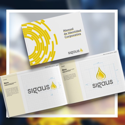
SIGAUS has recently renewed its visual identity with a new logo that evolves to adapt to the future but without losing the values that have always represented the Entity since its creation in 2007 nor the essence with which it was born: the protection of the environment from the negative impact of used oils and the promotion of the Circular Economy model, which is increasingly gaining momentum. The new logo is a slight evolution from the previous logo from 2012: conveying greater proximity and modernity, representing SIGAUS’ own evolution and its commitment to new challenges for the future, linked to innovation and sustainability.
 22-04-2021
24. Párrafo noticia nueva identidad corporativa
A redesign that provides a fresh approach, while respecting the essence of the previous logo, and with it, the values that have made SIGAUS a benchmark in waste management systems. This is the key to SIGAUS’ new visual identity. A renewed image intended to show the entity’s evolution and its commitment to the new challenges of the future while maintaining the priority objective with which it was born: to enable the collection and comprehensive treatment of used industrial oils throughout Spain. In this way, SIGAUS’ new image adapts to new media trends, and achieves a more effective visual communication
32. Párrafo cita. Nueva identidad corporativa
“
The new logo is already available on the website for use on any media and for incorporation into industrial oil containers.
„
Implementation on industrial oil containers
According to the provisions of article 11.4 of Royal Decree 679/2006, the integrated management systems for used oils must have an identifying logo, which will appear in a clearly visible place on the containers of industrial oils marketed through the adhering manufacturers.
To this effect, the new logo is already available on the website for use on any media and for incorporation into industrial oil containers, although in the latter case, and in order not to affect labelling processes underway and existing product stocks, the previous designs will continue to be valid.
The concepts behind the new visual identity
The Entity’s unity, solidity, and purpose to evolve and grow have guided the design strategy for SIGAUS’ new image, which includes more modern and advanced lines, while preserving the visual and chromatic essence of the previous logo—symbolising a drop of lubricating oil.
24. Párrafo imagen corporativa (2)
- Isotype update: SIGAUS’ representative ‘drop’ still remains so that the entity continues to be clearly identifiable by its stakeholders, but in this new version the isotype has been updated to convey greater proximity and trust. There is a new focus on rounder lines, representing a positive transformation, and the external arrow has gone, to be incorporated more subtly and dynamically on the inside, evoking the infinite cycle of industrial oil.
- Continuity in the colour palette: Yellow tones remain as base colours, with the addition of a slight gloss on the inside to provide volume and inspire a sense of protection.
- Custom-made typography: Round, compact and friendly are the qualities that define the ‘Syne Regular’ typeface, which has been selected for this new logo to create proximity, something that has also been reinforced with the use of lowercase. In addition, to make it distinctive and exclusive, the lines have been modified to increase the brand’s feeling of solidity and the dot on the “i” has been removed in order to make the visual result more compact.
- SIGAUS sub-brands: This evolution in the image of SIGAUS also responds to the need to standardise and connect the main logo, with the sub-brands that represent its different projects and initiatives with a visual identity of their own: ‘SIGAUS Forests’, ‘Environmental Classroom’, ‘You do more than you think’ and ‘Collaborator Workshop Programme’, which now include a design more in tune with the main identity. The ligature on the “g” becomes the unifying symbol for them all.
The end result of this update work, both on the logo and the SIGAUS sub-brands, is a fresher, more harmonious and cohesive brand image, without renouncing the base provided by the previous logo, created in 2012: solidity, trust and identification with the industrial oil sector, to properly convey the work carried out by the entity, which differentiates it from other waste management systems.